
Navigating the world of asset management is no longer confined to phone calls and paper statements. Today, asset management websites serve as the primary link between investors and their financial future. That’s why a well-designed website can do far more than create a positive first impression. It can be a powerful business tool for attracting new clients, building trust, and ultimately driving financial success.
Below, we’ll be presenting our Top 15 Asset Management Websites (in no particular order) and be evaluating their designs, user experience, and overall effectiveness in guiding visitors towards informed investment decisions based on the following criteria.
- UX/UI – The overall experience of using the site and its interface. The look and feel of each page based on elements such as color choice, menu styling, font selection, and visual hierarchy.
- Usability – How intuitive the site is to navigate and the ease in which visitors can get to the information they’re looking for.
- Accessibility – If the site was built with ADA Compliance in mind and utilizes elements such as alt text in images, high contrast text, and easy to read fonts (according to a recent report, 98% of U.S.-based websites are not accessible those with disabilities).
- Client-centric – If the site was built with the needs of its audience in mind.
- Performance & SEO – If the site follows best practices for performance and SEO (We recommend using tools like SEMRush and Google’s PageSpeed Insights to audit these more technical aspects of your website).
1. Acadian
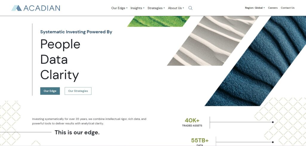
Acadian differentiate themselves from your typical asset management site by incorporating animations as visitors initially land on the homepage. This is a great way to signal to visitors that they’re in for a lively site experience. The site’s geometric bars filled with natural textures work well to create a sense of depth, while providing a welcome pop of color that’s on brand with the site’s palette of muted blues and greens. The homepage keeps things simple by linking out to the firm’s investment strategies and core company philosophies directly in the hero section. Acadian’s decision to animate details like the firm’s amount of traded assets, total data, and number of daily observations, is a great way to draw attention to these numbers while reaffirming their credibility as a firm.
As you dive into the site and explore Acadian’s Strategies pages, you’ll see more geometric designs up top filled with natural textures, keeping consistent with the design cues presented on the homepage.
UX/UI: 7.7
Usability: 7.5
Client-Centric: 7.0
Performance: 7.2
Accessibility: 9.3
SEO: 8.3
Overall rating: 7.8
Overall, an aesthetically pleasing site that provides value while not overwhelming users with information. Regarding performance, we suggest using next-gen image formats like WebP and AVIF over PNG or JPEG where possible, or an SVG if they are vector based. Utilizing these newer formats can improve site speed and reduce overall data consumption. Another suggestion that could improve user experience may be to utilize a megamenu to improve site navigation by reducing the number of clicks needed to access information.
2. ARK Invest
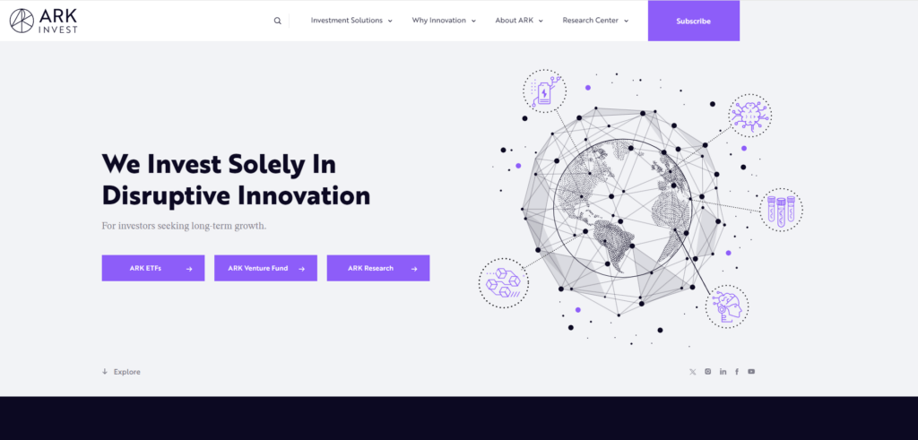
ARK Invest presents its visitors with a website that features no shortage of colorful icons and illustrations. While this styling for an asset management website may be uncommon, in our opinion it works well to spark curiosity and encourage visitors to explore.
The homepage is thoughtfully broken up into contrasting blocks of color, and clearly utilizes the 60-30-10 rule. This design guideline suggests using three main blocks of color in a page’s design: 60% dominant, 30% secondary, and 10% accent, to achieve a balanced and harmonious look. The site’s Call to Action (CTA) buttons follow best practices by utilizing bright contrasting purples which work well to draw in the eye.
UX/UI: 8.2
Usability: 8.0
Client-Centric: 7.6
Performance: 8.0
Accessibility: 7.5
SEO: 9.1
Overall rating: 8.1
After our evaluation, we feel that ARK Invest made a lot of solid design decisions throughout their site, like the use of bold text and graphics to keep visitors engaged and keeping the homepage short and concise. One element we saw that could improve both user experience and performance of the site would be to avoid large layout shifts by assigning dimensions to images and compositing animations on each page.
2. Fidelity Investments
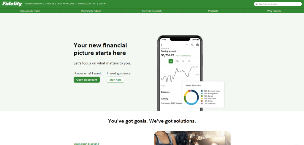
Fidelity opts for a centered page design on their site that looks just as inviting on desktop as it does on mobile. Up top, they offer two distinct customer journeys, making it easy for first-time visitors as well as those already familiar with investing to feel comfortable navigating the site. Fidelity offers one of the most client-centric site experiences we’ve seen, with each CTA offering useful information for prospective clients on topics from retirement planning, to how to get started investing.
A feature worth calling out is the interactive chart along the bottom of the page that displays how much money someone could potentially make based on a hypothetical monthly contribution to an investment account. An ingenious visual that would encourage anyone to begin planning for their financial future. Fidelity’s site is further set apart by its virtual assistant located on the bottom right of the homepage, ready to assist clients or prospects alike.
UX/UI: 9.1
Usability: 8.0
Client-Centric: 9.3
Performance: 4.4
Accessibility: 10.0
SEO: 8.3
Overall rating: 8.2
Overall, a simple and thoughtfully designed site with only a few performance enhancements that we would suggest that could ensure smooth functionality in the future. The site currently relies on third party cookies, which are scheduled to be removed from Google Chrome in the near future. Additionally, we see that deprecated APIs are also used, which once removed from Chrome could also cause site errors. Lastly, the site contained large JavaScript payloads, which could result in slower loading times, impacting both performance and SEO.
4. Allspring
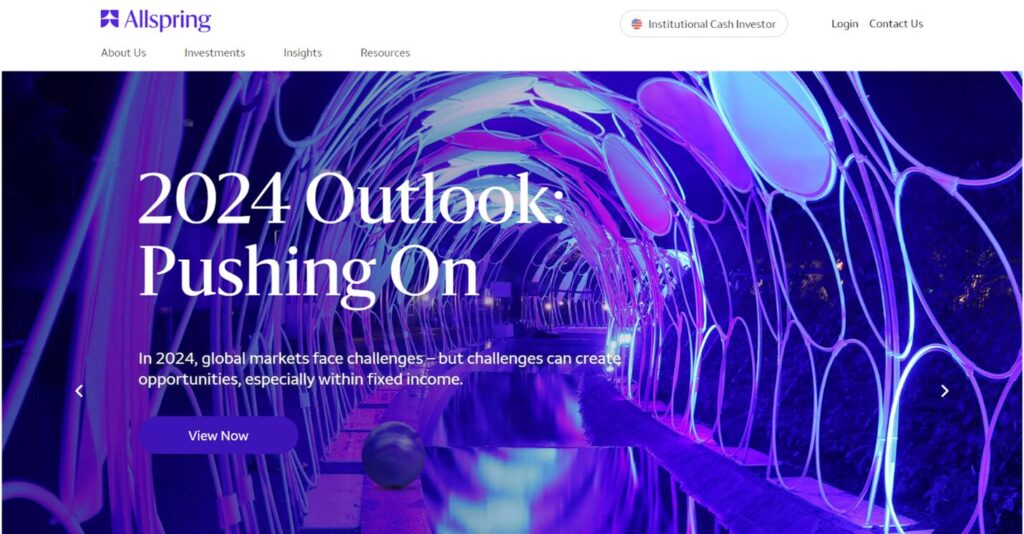
Allspring’s website keeps things both bright and lively, offering a homepage where bold colorful photography takes centerstage, rather than lengthy paragraphs of text. The site’s nice and clean entry page helps you identify your region and investor type off the bat for a personalized user journey. The personalization adds value by presenting relevant thought leadership content depending on your role selection, starting from the homepage carousel header.
Instead of packing tons of options into the top navigation, sub-menus are well utilized, and specific fund information is easy to access. Overall, the purple, white, and grey color scheme combined with the minimal use of text on the homepage make for a modern and streamlined experience that doesn’t overload visitors with information. Navigation felt responsive and loading animations were infrequent yet on brand with the site’s purple theme. The predominant use of purple throughout the site’s design works well to create a sense of familiarity with the brand.
UX/UI: 8.1
Usability: 8.1
Client-Centric: 8.1
Performance: 9.8
Accessibility: 8.7
SEO: 8.3
Overall rating: 8.5
Overall, Allspring presents an impressive website experience. We can clearly see the time and effort put into creating this final product. Some areas we would suggest watching out for include the use of third-party cookies, as these will be removed from future versions of Google Chrome as well as the use of deprecated APIs.
5. PIMCO
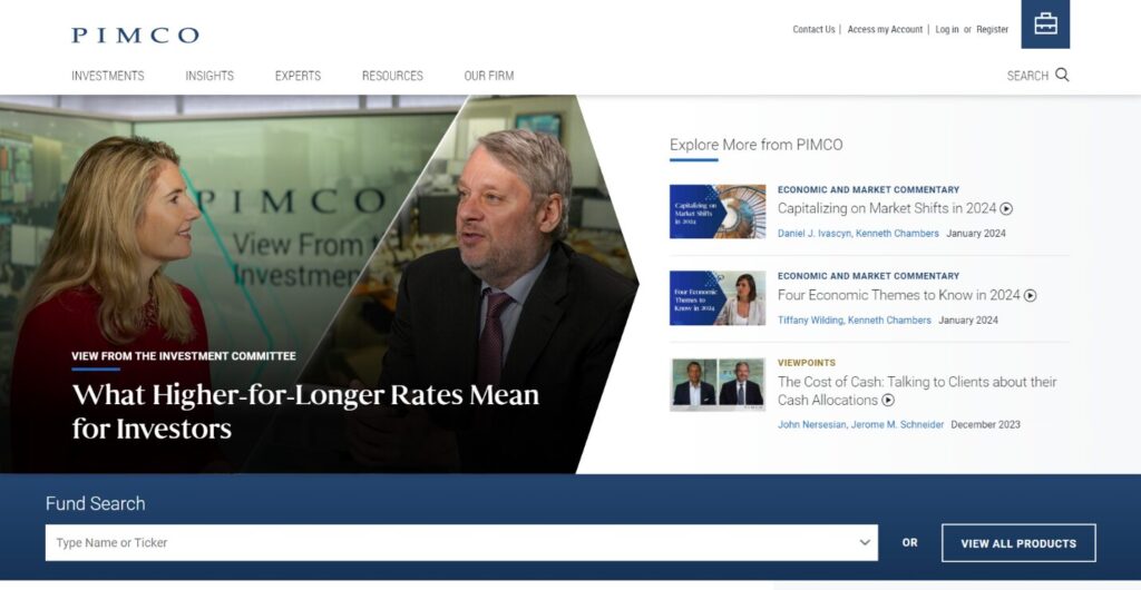
PIMCO also provides a customized site experience. Their landing page prompts visitors to select their investor type before proceeding to the main site. Once arriving on the homepage, we can see that the site’s content blocks were positioned with F-pattern reading in mind. This is a common reading pattern that users exhibit when browsing website content and is named after the shape that eye movements form as they scan a page.
The site feels consistent with plenty of dark blues and geometric design cues throughout. Overall, the content feels very customer centric, with links to relevant insights on topics like tax planning strategies and interest rates, located directly on the homepage. Additionally, the homepage is divided by a blue block that contains a search bar. This search bar lets visitors type in their query or select from any of the drop-down options.
UX/UI: 7.5
Usability: 8.1
Client-Centric: 9.1
Performance: 6.9
Accessibility: 9.5
SEO: 9.1
Overall rating: 8.3
PIMCO’s site is a pleasure to use, but in our analysis, we found 4xx errors (potentially 403 or 404) on the site which may be due to locked content that cannot be crawled, or pages that were removed. We suggest setting up a redirect (preferably 301 permanent redirect for SEO purposes).
6. Dimensional Fund Advisors
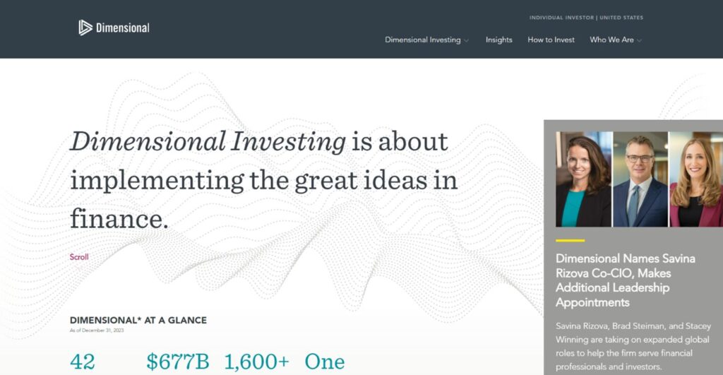
Dimensional Fund Advisors take a maximalist approach to their website, packing their homepage with several interactive elements for visitors to explore, while keeping text to a minimum. With a clear and organized entry page, visitors can easily select both their region and investor type, creating a personalized experience from the start. After confirming location and investor type, visitors are taken to the homepage which prominently displays interesting stats about the firm. Each stat displayed helps to build trust between the firm and legitimizes their credibility to prospective clients.
Aesthetically, the dotted wave design behind the serif font works extremely well, filling space behind the text while not detracting anything in terms of readability. The hero section design is also worth calling out as it utilizes what would’ve otherwise been white space as a place to thoughtfully display news and insights about the firm.
UX/UI: 9.0
Usability: 8.2
Client-Centric: 8.1
Performance: 3.3
Accessibility: 7.8
SEO: 9.2
Overall rating: 7.6
From our evaluation, it’s clear that Dimensional Fund Advisors put a lot of thought into designing their site. To provide an even better user experience, we recommend reducing unused JavaScript, and using LazyLoad, which when enabled will wait to render content on a webpage until the user or the browser needs it. This will greatly help speed up page loading times. Read our article How to: Improve Your Website Page Load Speed and SEO to learn more.
7. Harding Loevner
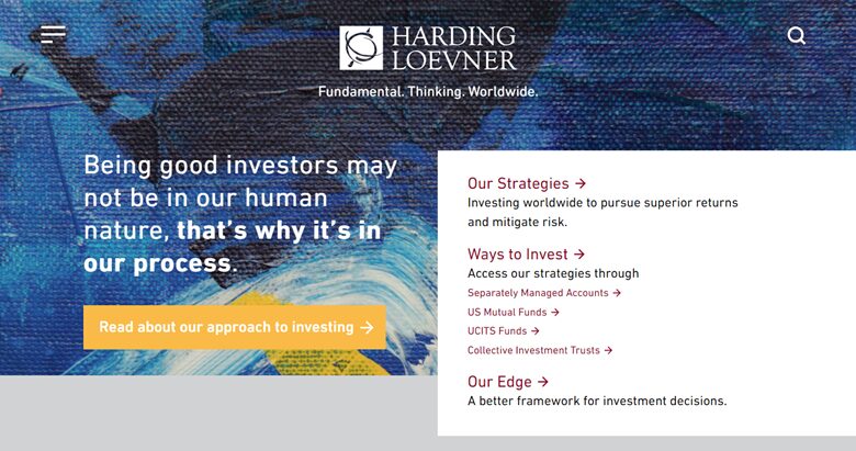
Harding Loevner set themselves apart by presenting visitors with a site that’s far from what you’d expect from an asset management firm. Rather than using their company colors along the hero section, Harding Loevner chose to use a colorful abstract painting instead. But the changes don’t stop there. Harding Loevner ditch the traditional navigation experience and opt for a simplified hamburger menu along the top left of the site. While this is a newer trend, there are trade-offs to using it. If paired with adequate Call to Actions, it can have a positive effect of highlighting your content and allowing you to more strongly guide the user journey.
UX/UI: 8.1
Usability: 8.5
Client-Centric: 8.1
Performance: 5.8
Accessibility: 7.8
SEO: 7.5
Overall rating: 7.6
While we appreciate Harding Loevner’s unique website design, we feel that some aspects of the UI could be improved. For example, the choice of white text on the site’s top CTA could be changed to something that provides a bit higher contrast against the yellow button.
8. GQG Partners
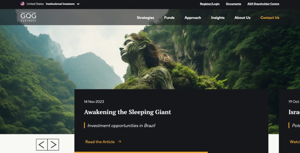
GQG presents its visitors with a dark, high contrast website that was clearly designed with accessibility in mind. The site’s white, black, and gold color palette, coupled with engaging imagery make for a modern and sophisticated look. It’s also refreshing to see uniqueness in an industry full of blue color themes. GQG’s homepage features animations that are both functional and well timed, displaying animated progress bars and manual control options. While many of the sites we mentioned include personalized user experiences, GQG take things a step further by displaying unique content within pages based on user segmentation. This is a great way of creating a unique experience for users by prioritizing relevance. The website also represents a highly integrated tech stack working in tandem with their email marketing and video providers, allowing visitors to seamlessly access and read insights or attend topical webinars.
Site navigation is quick and responsive with a simple menu up top that expands on hover, making it easy for visitors to find the information they’re looking for in just a few clicks. The navigation is styled consistently with the rest of the site, using high contrast white text on black.
UX/UI: 9.2
Usability: 8.9
Client-Centric: 9.3
Performance: 8.6
Accessibility: 8.2
SEO: 7.7
Overall rating: 8.7
In our evaluation, it’s clear that GQG Partners put a lot of thought into designing their site. From dynamic personalization options that allow for a unique site experience across several different regions and investor types, the boutique investment firm offers an easy-to-use site that’s packed with useful information for investors. We’re also fans of the firm’s use of unique eye-catching video headers that take advantage of the latest AI image creation tools.
9. Invesco
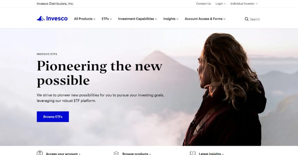
Invesco’s site offers a customized user experience from the start, prompting visitors to select their investor type before proceeding to a bright and airy homepage that utilizes bold accessible fonts coupled with inspirational photography. The photograph chosen for the header up top works particularly well due to its subtle warm colors and use of a person in the image. It also pairs well with the site’s tagline. The site’s top navigation is responsive and requires minimal clicks to navigate to items like specific fund information or investment insights, making for a pleasant user experience. With high contrasting CTAs throughout, we can tell that this site was built with client accessibility in mind.
UX/UI: 9.0
Usability: 9.0
Client-Centric: 8.1
Performance: 8.4
Accessibility: 10.0
SEO: 6.7
Overall rating: 8.5
During our site evaluation, we noticed that the Invesco’s site uses third-party cookies. We suggest moving away from the use of third-party cookies as they will be removed in future versions of Google Chrome.
10. Janus Henderson
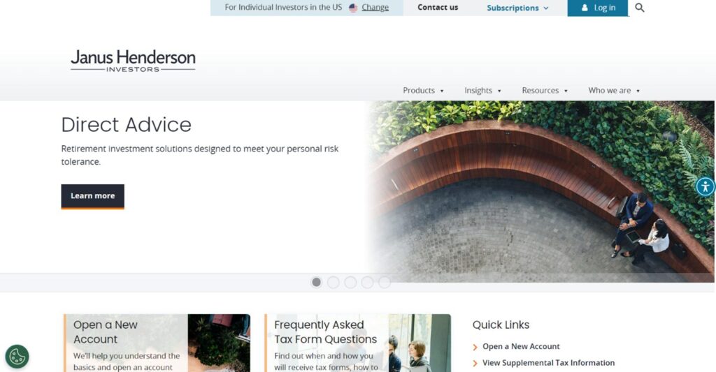
Janus Henderson offer a personalized user journey from the start, prompting users to specify their investor type before proceeding. Once selected, visitors are brought to a customized homepage with information that’s tailored to their investor type. Curated insights are presented along the hero section of the site in a carousel that advances about every 10 seconds. You can easily jump to a specific article by clicking on the corresponding dots below, a nice UI decision that saves time for the visitor. In the carousel design, by using a gradient that fades from a photo to white, the contrasting Call to Action button stands out well, no matter the image used. When landing on an article page, the amount of time it will take to read the piece as well as key takeaways are displayed prominently up top. This is a great way to lead-in to the content of the article and let readers know what to expect from the piece.
UX/UI: 9.0
Usability: 8.2
Client-Centric: 8.1
Performance: 4.7
Accessibility: 9.3
SEO: 8.2
Overall rating: 7.9
We enjoyed Janus Henderson’s site due to its simplicity and consistent site style. The use of orange and blue in combination, creates a clear visual hierarchy and directs the visitors eye to specific site elements and content. In our analysis, we found that this site has a higher than usual JavaScript load time. To reduce this, we suggest delivering smaller JavaScript payloads, which can improve page load speeds.
11. Alliance Bernstein
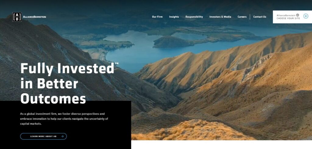
Upon landing on Alliance Bernstein’s site, visitors are presented with a series of short 2-3 second video clips of nature and people. Since these videos only play one time, this effect works well to create an immersive experience, while not overwhelming or distracting from the overall utility of the site. The choice of bold contrasting white text on the main menu and across the hero section make for an easy-to-read site that was certainly created with accessibility in mind. Typography decisions throughout this site are excellent, with the combination of bold modern fonts and more subdued styles that work together to establish a clear sense of hierarchy.
Site navigation is quick and easy, with five main sections across the top to choose from, and relevant sub-menus within. The menu is supplemented with a separate clear Contact Us menu item to complete the list. As you scroll down the homepage, you’ll see a selection of the firm’s insights that correlate with the investor type you’ve selected.
UX/UI: 8.5
Usability: 8.1
Client-Centric: 7.6
Performance: 5.5
Accessibility: 6.9
SEO: 7.5
Overall rating: 7.4
Overall, a nicely designed site that invites visitors to explore. A few items that we noticed in our site evaluation include images that could be optimized in size or potentially delivered in next gen formats like WebP and AVIF over PNG or JPEG where possible, or an SVG if they are vector based. Additionally, we found that Javascript execution times were a bit high. One way to reduce this time, would be by delivering smaller JavaScript payloads.
12. Allianz
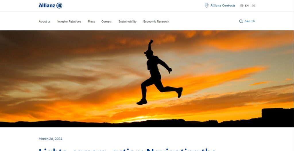
The Allianz site keeps things simple by letting the most recent company insight take centerstage in their homepage’s hero section. Just above, we see a responsive megamenu that rolls down on hover, making it easy to choose between the site’s numerous offerings. There’s also a handy search bar up top right that is both speedy and responsive in displaying results. As you move down the page, you’re presented with podcasts, additional featured insights, and an embed of their social media feed. It’s worth calling out that most images on this site feature people. This is a great way to humanize the firm and add increased visual interest to the site.
UX/UI: 8.1
Usability: 8.1
Client-Centric: 8.1
Performance: 6.5
Accessibility: 10.0
SEO: 8.3
Overall rating: 8.2
Allianz’ website is packed with information, yet it’s organized well and presented clearly. This isn’t an easy feat to achieve. In our site analysis, we noticed that the Largest Contentful Paint, or LCP score was high. This score measures the loading time of the largest element on the page, in this case the featured image up top. One way to improve an LCP score is to properly size images and serve them in next gen formats like AVIF or WebP, instead of PNG or JPEG where possible, or an SVG if they are vector based.
13. CIBC
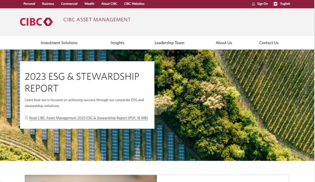
CIBC’s asset management website is clean and simple, with an easy to navigate mega menu that folds down on hover, making it easy for visitors to jump to different sections of the site. Each of the site’s five sections are designed consistently like the homepage, with white blocks overlaid on top of photographs and text styled in all-caps, allowing for great readability. A unique detail worth calling out is this site’s use of “breadcrumb navigation” which allows visitors to see the path they took to get to a specific page on the site. This secondary navigation is a great way to simplify a site with many hierarchically arranged pages and allows users to navigate to higher-level categories with ease.
UX/UI: 7.8
Usability: 8.2
Client-Centric: 7.5
Performance: 7.3
Accessibility: 9.5
SEO: 9.2
Overall rating: 8.3
CIBC offers visitors a useful site with lots of information to be found within. We also enjoyed seeing bright color photography on many of their pages. The website contains invaluable content, we would suggest considering making additional blocks more interactive to the user to save space and keep the reader more engaged. This can be in the form of interactive calculators, hover effects on the people pages, or powerful data visualizations.
14. Calamos Investments
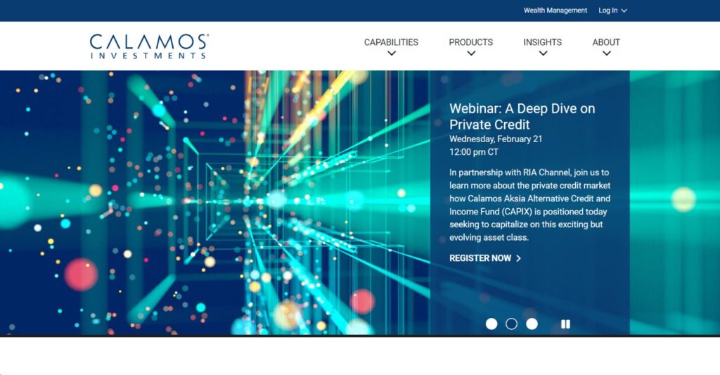
Sometimes less is more. Calamos Investments present us with a simple yet effective site that includes a snappy and responsive menu up top that’s both accessible and easy to navigate and supported by a megamenu with useful content. It’s easy to navigate due to its high contrast and ability to hover over sections without needing to click. While this may seem like a small detail, it can make a drastic difference in the user experience. The homepage is styled consistently, with shades of the firm’s signature blue branding found throughout and their featured funds highlighted prominently on the homepage for easy reference.
UX/UI: 8.1
Usability: 8.1
Client-Centric: 7.9
Performance: 10.0
Accessibility: 8.7
SEO: 8.3
Overall rating: 8.5
Calamos’ site had a nearly flawless score on Google’s PageSpeed Insights, quite impressive! However, we did notice some potential areas for improvement in the site’s mobile experience. We noticed a high Largest Contentful Paint score, which as mentioned above, can be reduced by properly sizing images and serving them in next gen formats like AVIF or WEBP.
15. J.P. Morgan
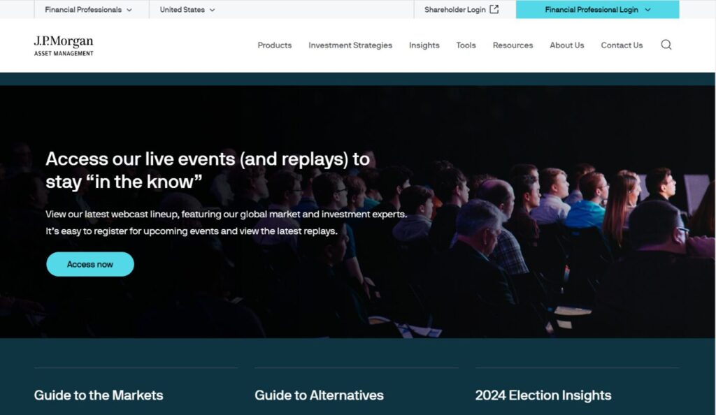
J.P. Morgan break up their site with blocks of contrasting colors and utilize the rule of thirds (power of 3) in several areas to both organize their content and draw attention to specific areas of each page. Like many of the sites we’ve covered so far, JP Morgan also offers a customized site experience based on user’s investor type and country selection. We enjoyed the use of large easy to read text and strong CTAs throughout the site. The benefits to this are twofold as they make it easy for visitors to find the information they’re looking for and contribute to the site’s perfect accessibility score.
UX/UI: 8.1
Usability: 8.1
Client-Centric: 8.4
Performance: 3.2
Accessibility: 10.0
SEO: 9.1
Overall rating: 7.8
Overall, J.P. Morgan presents visitors with an accessible site experience with clear contrasting colors used throughout. In our analysis, we noticed a few performance issues to improve upon regarding JavaScript execution time. We suggest reducing the time spent parsing, compiling, and executing script by delivering smaller JavaScript payloads.
Conclusion
We’ve seen some great examples of asset management firms leveraging distinctive designs to set themselves apart, all while simultaneously adhering to modern web design principles and best practices. One common thread we noticed was that many of the sites we selected chose to implement custom user journeys. This is a great way to tailor your site to multiple audiences and enhance the user experience.
While this isn’t every website we’d like to show you, we felt that our selection displayed a broad range of styles and possibilities to inspire your next site design. Which one was your favorite? Drop us a line if you would like a review an asset management site or tips on designing your own.
Tips you should know
- Focus on user needs and goals. Design your site in such a way that makes it easy for visitors to find what they’re looking for and complete tasks with minimal effort. This includes creating intuitive navigation, and using a clear visual hierarchy in your design, so visitors can understand your site at a glance.
- Make sure your website is easy to use for people of all abilities by following accessibility guidelines, such as those provided by WCAG. These include, but are not limited to using alt text on images, providing subtitles on all video content, and using clear and concise language throughout your site.
- If you’re looking for even more detail about improving your site’s SEO, check out How to: Improve Your Website Page Load Speed and SEO. This useful guide provides an in-depth look into ways to improve user experience by showing you how to deliver your site’s content quickly and efficiently.
Have questions? Get in touch with an expert today.
About HomeTree Digital
HomeTree Digital is a full-service digital marketing agency for financial services. We incorporate design & creative elements to our work and specialize in email marketing, social media marketing, paid advertising, videography, web development, custom integrations and automations. As a Salesforce Certified Partner, we can assist with the architecture, administration, or development of your CRM. If you are facing challenges in any of these areas, please reach out to us for assistance. Personalize your subscription to receive regular updates.
HomeTree is defined as a wise resourceful home that provides knowledge, instills inspiration, encourages creativity, and protects. While harmoniously connecting its residents through its branches and roots to the outer world. This accurately describes the approach we take when it comes to our clients. We believe in excellent customer service and prioritizing you. Our mission is to provide you with the know-how to succeed in a rapidly evolving digital world.