
Email is essential and can prove to be one of the most effective marketing channels, when used correctly and combined with other channels—such as websites, search marketing, and social media.
The one area email excels in against all other channels, is personalization. You can tailor your message directly, to build a stronger interaction with your prospects and clients. The added benefit of tracking their activity and engagement can help you tailor your conversations to their needs through email and in-person.
What’s more is that you can automate this process, so you don’t bog down your sales team to constantly reach out. Instead, setting up drip campaigns can nurture your leads in a standardized best practice manner. The reporting and analytics gathered through Email Marketing campaigns provides your sales team with detailed analytics to help them prioritize their list and focus on the warmer leads with tailored content for their meeting.
Email marketing still remains unmatched when it comes to return on investment (ROI), driving a whopping $36 return for every $1 spent, according to Litmus.
That may all sound fine and dandy, but how do you get started? The first step is to ensure your email templates are correctly laid out. Good email design doesn’t just impact visual appeal. It can help you build stronger relationships with your audience and produce better results. Let’s take a closer look at what should be top of mind, when it comes to email design.
Email Design Layout
Hierarchy
On average, people spend around 10 seconds reading an email. This means you have limited time to keep them interested, which is why your email template should be easy to scan and understand in less than 10 seconds. You can do this with best practices that include using structures, layouts, colors, fonts, images, and by using white space to your advantage.
A great structure to follow that helps create a strong visual hierarchy is the Semantic Structure. In this method the most important headline is bold, and the largest font is at the top. The lower you get on the email the smaller and less bold the headlines become. This clearly defines importance to your readers and makes it more legible. You can see an example of the Semantic Structure below.
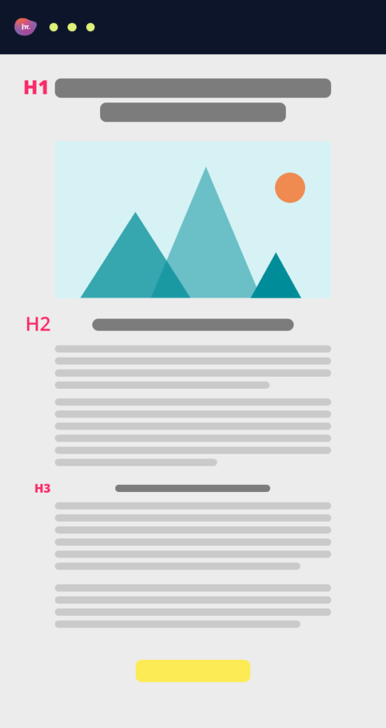
H1 is your primary headline – meaning the first one your readers see when they open your email. Make this heading have your most important information in it. It should stand out against the rest of the email and describe what the email is about. This is the title of your piece.
H2 is your secondary headline. This font should be smaller and thinner than H1 to separate it from your primary headline. In many cases these headlines separate the main body of your email.
H3 or tertiary headlines and even smaller than the H2 tags. In certain email templates these are used as related articles or content that the reader can click on if they’re interested in reading more.
Layout Elements
Below we list the various elements found in email design.
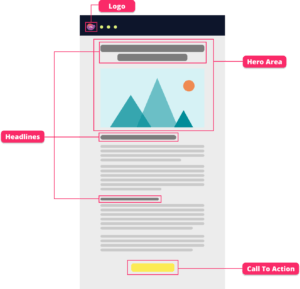
Logo
Place your logo at the very top of your email so your subscribers recognize you.
Headlines
Headlines are essential in email design. They make your emails easy to scan and improve readability.
Hero Area
The hero area is the very first headline and image the reader sees. This section will determine if the reader continues to read the email or not, so make it count!
Call To Action
What do you want your subscribers to do when they receive your email? This could be anything from following your Instagram account, entering a competition or even a direct link to invest in a product of service.
Primary CTA is the main action you want your reader to take.
Secondary CTA is any further action you want your reader to take.
It’s important that you make your Calls to Action stand out in accordance with priority. This can be with the size of the button, font, capitalization, empty space around it, color, or reverting to a text link for a secondary CTA. At the same time, remember to stay on-brand and avoid ruining the overall aesthetic of your email design.
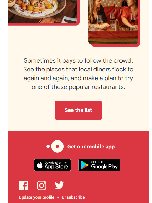
What do you think the OpenTable example to the right got wrong? The same red color is being used throughout the template for the footer, Call to Action, and other areas. This takes away from the button itself.
Layout Trends
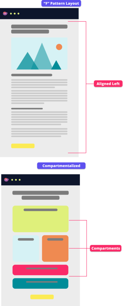
F – Pattern Layout
One way people view emails is through an F-shaped scanning pattern. The eye begins at the top-left corner of a screen and scans across it in a horizontal movement. From there, it follows the same horizontal movement as the reader navigates down the page, with the horizontal length getting shorter and shorter.
This type of eye movement occurs when people are observing large bodies of text, which generally defines financial marketing content. To apply this layout in your template, all you have to do is align everything to the left – headings, body paragraphs, images… everything!
Left-aligned text also performs best for readers because it helps the eye find the start of the next line when it leaves the end of the last one. According to the University of New Brunswich, right aligned or centered text changes the starting place of each line forcing readers to work harder to find where each line begins to continue reading. This can impede reader’s speed and comprehension.
Other layouts include Z-pattern and Inverted Pyramid. Z patterns can be used for image-heavy designs and manipulate the way a person views the email. Inverted pyramid patterns draw scanning viewers toward a focal point at the bottom of an email.
Compartmentalized
A compartmentalized email layout is another great way to improve readability. Each section is separated into their own compartments and often outlined making it easy to scan over.
Single Vs. Multi Column
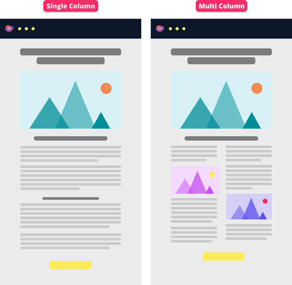
Single column layouts usually consist of one topic or call to action. These are usually used for quick emails and typically easier to read through.
Multi column layouts are generally used if you would like to highlight more than one focal piece. For example, if you’re running a quarterly review & outlook webinar you may want to add the main body of content in the left column and then highlight the speakers with their images to the right. The general recommendation is the use of a single column layout as it’s more scalable. That being said, it all comes down to your content.
Email Design Creatives
Animations
It’s no secret that there are certain limitations when it comes to email. Videos and forms for example cannot be added within the email itself (you can link to one from it). So, what other tools do you have available to you? Yes, the title may have given it away, you have animations.
According to the Email Institute, animated images increase click-through rates by up to 26%.
The best file types to use for animated images in emails are GIFs and APNGs.


Images
Images are easier to digest than text. You have the added benefit of using colors that can evoke a variety of emotions. This gives you an advantage to gain a stronger emotional engagement with your audience. Images can make your content relatable or inspirational and keep your reader more engaged. Choose wisely!
The best file types for photos or graphics are PNGs, for transparency, or JPGs, for high-resolution imagery.
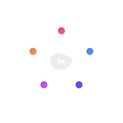
Icons
Express creativity using icons. They are a great way to convey a message without getting too wordy. For example, many companies use social media icons in their emails – people already know if they click on the LinkedIn icon it will bring them directly to the company’s LinkedIn page.
Here’s a few examples:


Email Design Content
Calls To Action
What is the purpose of the email? What do we want our subscribers to do after receiving this email? These questions are necessary to ask when making a Call to Action.
When designing an email, it’s also important to make your call to action stand out. Whether it is a giant red “Click Here” button at the bottom of your email or an enticing graphic for people to click on and RSVP to your event; the important part is to make it stand out and be on-brand.
Fonts & Typography
The importance of typography in design cannot be overstated. However, in Email Marketing not all recipient email clients render all fonts. This is why using a Web Safe Font can make all the difference. Web safe fonts are typefaces that come already installed on most devices and will display to the email recipients as intended. These fonts include:
- Arial
- Courier New
- Verdana
- Georgia
- Times New Roman
- Lucida Sans Unicode
- Tahoma
- Trebuchet MS
Remember to leverage typography to create a sense of hierarchy in your layout. For example, you can achieve this by using different typefaces or fonts for the title versus the body. This can make your template more legible and more important content stand out.
Readability
Keep your readability in check with the following tips:
- Align all your text to the left – including headings. This will make it easier for your subscribers to read.
- Use the hierarchy method to emphasize what is important in your email and what the readers should remember most.
- Use between 14-point and 18-point font for your body paragraphs. This size will translate well from desktop to mobile viewing. Alternatively, you can render your copy on mobile differently to be more legible.
- Keep line spacing around 1.5-2 instead of single spacing.
Design Trends
- Typography is a huge part of Email Marketing. Big, bold, and distorted fonts are what grabs people’s attention, and this maximalist trend is on the rise.
- Pastel colors are in right now. Using pastels can convey a sense of calmness and peace, making them a great option for your email designs.
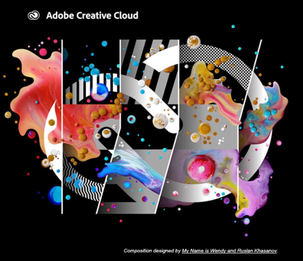
- Mixed media is also huge right now, which combines multiple elements such as illustrations, shapes, and photography in one composition.
- Dark Mode is used by almost 82% of people on their phone—making your emails available to view in dark mode is a huge plus. This is made possible through coding.
- We all know trends get recycled all the time but right now the “Retro Nostalgia” look reminiscent of the 1970s –1990s is taking the design world by storm. The use of warm colors, retro fonts, photo filters and fashion are making a huge comeback. These eras also took shapes like arches and waves and made them into standard elements of their signature styles.
- Another trend right now in color is gradients. Going along with old school inspiration– using a multi-colored gradient gives off tie dye vibes nostalgic from the 1990s. We love this trend so much at HomeTree Digital we showcase it on our very own logo!
Tips you should know
- Space out your Calls to Action. Apart from making them stand out, try not to bunch more than one together as they work against each other. You should also have less prominent supporting copy next to CTAs if needed.
- Not getting great email engagement? Maybe you’re not connecting. Read Stoneshot’s 8 Powerful Email Marketing Storytelling Tips.
- The right brand name can make or break your business. DesignRush released Brand Name: The Ultimate Guide that’ll help you choose a brand name that represents you, and key characteristics that’ll make it memorable.
- 40% of B2B marketers claim that email newsletters are the most important tactic in their content marketing strategy. (Source: Content Marketing Institute, 2017)
- Tuesdays, Wednesdays, and Thursdays are the best days of the week to send emails. (Source: Coschedule)
- 88% of smartphone users check their emails on their phones. (Source: Constant Contact, 2022)
- High growth financial services brands are 1.35x more likely to have DE&I-related (diversity, equity, and inclusion) branding and messaging imagery than negative-growth brands. (Source: Showing Empathy in Financial Marketing Emails, StoneShot)
- Still searching for your next email design? Explore DesignRush’s guide, Email Design Inspiration: 15 Best Campaign Examples By Type. This valuable resource breaks down several different ecommerce emails, helping you understand the key elements of a successful design that delivers results.
- 20 Proven Email Marketing Strategies and Tips for 2022 (Source: ContactOut)
Email design is a crucial marketing tactic. It’s important to structure your content so it’s easy to read and make sure your content is attention grabbing. No matter what industry you’re in trying to stay up to date on the latest trends is crucial to keep your brand interesting, even if you do it in a subtle way.
Have questions? Get in touch with us to speak with an expert today.
About HomeTree Digital
HomeTree Digital is a full-service digital marketing agency for financial services. We specialize in branding & creative, videography, web & mobile development, integrations, automations, email marketing, social media marketing, paid advertising, SEO, and analytics. If you are facing challenges in any of these areas, please reach out to us for assistance.
HomeTree is defined as a wise resourceful home that provides knowledge, instills inspiration, encourages creativity and protects. While harmoniously connecting its residents through its branches and roots to the outer world. This accurately describes the approach we take when it comes to our clients. We believe in excellent customer service and prioritizing you. Our mission is to provide you with the know-how to succeed in this rapidly evolving digital world.